Choropleth Mapping
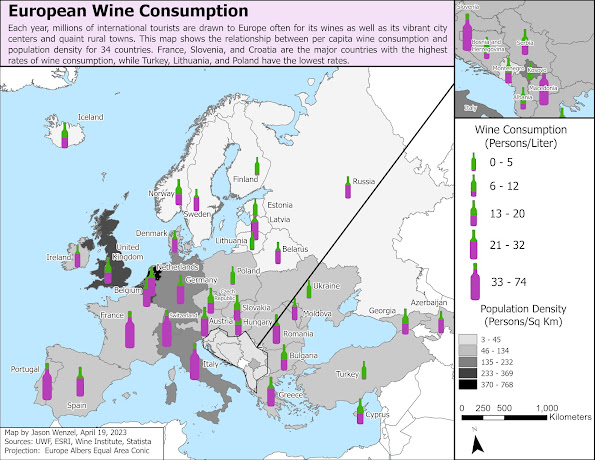
For this week’s module in Computer Cartography, I created a map that displays the rate of wine consumption in relation population density for 34 European countries. For the primary map, I used custom graduated symbols by creating a five-tier wine bottle marker scheme, to show different levels of wine consumption per capita for each country (litter/person). I did this by downloading a creative commons/free .jpg of a wine bottle, editing it to show a green base (for the bottle/container) and then creating five different versions with purple fill to show different levels of consumption (the most filled with purple, the highest level). I then converted these to individual .svg files to import into ArcGIS. Further, I did use some proportional scaling to size each one different (the larger the bottle, the higher the wine consumption) to better convey the variation along with the level of purple fill. To show population density of the associated European countri...