Map Evaluation
This week in Computer Cartography I completed the first lab which involved the evaluation of two different maps (one well-designed map and one poorly-designed map) that we were able to select from several provided in our lab materials. The maps were evaluated using a map evaluation template provided to the class. In addition, I evaluated the well-designed map with three of the six commandments of map design based on the 20 "Tufteisms" from statistician Edward Tufte's The Visual Display of Quantiative Information. I end with making three main recommendations to improve the poorly-designed map.
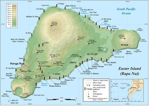
For the well-designed map, I selected an example of a map of Rapa Nui (Easter Island) because I am interested in developing something similar for my own projects: a topographic reference map that shows archaeological sites and features in relation to elevation, major roads, cities, and the coastline.
Based on Commandment 1 (Map Substantial Information), I believe this map shows graphical excellence, is overall well-designed, and is interesting to view. The map has some complex information but it is presented in a very clear, precise, and efficient way. The viewer can browse the multivariate information relatively quickly to find points of interest (archaeological sites and features) in relation to roads and populated areas without using too much space. The complex of the map is revealed sufficiently.
Regarding Commandment 3 (Effectively Label Maps), while the resolution of the graphic on hand is poor, thus it is difficult to discern the text, I believe if this was improved, the labels are quite effective in terms of size, font, and placement. I believe the issue of labels defeats distortion and ambiguity present. The legend appropriately describes the symbols except some discernment is needed between the two types of populated places, unless the viewer assumes the slightly larger hollow point reflects the larger populated area and the smaller enclosed black point reflects the smaller ones.
For Commandment 5 (Map Layout Matters) I believe the layout of the map is good in terms of its centering of the island landmass at about 50% wider than tall. The island is in an interesting triangle-like shape with appropriate placement of map elements in the "white," or ocean/blue space. Inclusion of a north directional arrow would have been helpful as the viewer might be curious how exactly the island is oriented in the map.
Aside from some of the issues presented, I believe this is a well-designed map and it engages my own imagination in exploring this island and its unique cultural and archaeological resources.
For the poorly-designed map, I selected one of a massive cluster of point features distributed along the northwestern Gulf of Mexico because of its poor design and I feel that it is one of the worst in the sample collection provided. I do think, however, this map might have some potential and I found some motivation in critiquing it given my own interests in its geographical extent, the northwestern Gulf of Mexico (even though my own region around Panama City is cut out of the right.
I recommended three areas where this map could be improved:
1. Include the appropriate map elements (title, north
arrow, scale, legend, consistent bordering, credits, source, and inset map).
2. Change the symbology of the point features-remove the tails and reduce size (small enclosed circles would work and reduce the black mass of clutter).
3. Adjust the color of the land and water. I suggest lightening the land to a yellow tone and bring out the blue better in the Gulf, but nothing too bright; instead something with more life. This might bring out the black points, and their distribution better. Overall, the map is too drab.
Whatever is done, the theme and purpose of the map certainly needs better definition.


Comments
Post a Comment