Cartographic Design
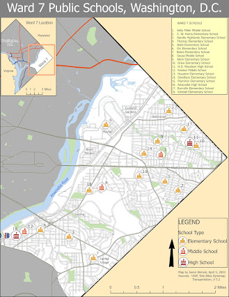
This week’s module in GIS 5007 covered cartographic design principles where we were directed to produce a map of public schools in Ward 7 of Washington, D.C. One of the main objectives of the assignment was to employ Gestalt principles of perceptual organization related to cartographic design. By employing visual hierarchy, I made sure to give the thematic symbols and type labels the highest priority. I clipped the Ward 7 schools from the DC schools layer, and then assigned unique symbological values to elementary, middle, and high schools by using three distinct school house icons from small to large respectively. For the three school types, I used red-orange fonts then set the size for each at three different levels (Tuscan red 26 pt for high schools, Flame red 24 pt for middle schools, and Seville orange 22 pt font for elementary schools). Each school was labeled with a number that corresponded with a list place in the top right corner. Each school was labeled with Tahoma 10 pt black font. For the title, I used Tahoma black font at 32 pt font. In the top right corner, I created a list of the 18 schools in Tahoma regular 8 pt font (with heading WARD 7 SCHOOLS).
Base information included filling in the color of main layout to Sahara sand yellow. I filled in the color for the WashingtonDC layer with a 30% gray and then created a black border line of the city’s eastern boundary with a 3 pt width. I then colored the polygon for Ward 7 as white to make it appear clear to the viewer (figure-ground relationship). Neighborhoods were labeled with a regular Tahoma, 8 pt font.
For water features, including rivers, I used the default blue for water in ArcGIS. I labeled the Anacostia River with curved text, in an italtic darker Lapis Lazuli blue 10 pt font. For parks, I used the default green parks. For the roads, I used Minor Roads default set at 1.6pt font for Ward7Street, 0.5 pt width 80% gray for MajorStreets, a flame red 2 pt width line for USHwy, roads, and Ultra Blue 2 pt width line for the Interstate. I also included a shied symbol for the Interstate (far left corner). Next I added scales and north arrows, and placed a section for the data source. For the data source, I used Tahoma regular 8 pt black font. For the legend, I also used Tahoma regular black font with title “LEGEND” at 22 pt, and the group layer and layer names at 18 pt font.
I also included an inset map in the top left corner. I used similar hues to the main map, but with 30% gray for the background. I used Ultra Blue 1 pt line width for Interstate and Flame Red 1 pt width for USHwy. I used the default water blue in ArcGis for SurfaceWater. I added the label “Ward 7” with curved text over Ward 7 in Tahoma 10 pt font. Then I added labels for “Virginia” and “Maryland” in Tahoma 8 pt font. I edited the field for “Washington” to “Washington, D.C.” then added a 1 pt halo so it would stand out. I then placed a box around Ward 7 with a 3 pt Cantaloupe colored line. I created an annotation feature class for the WashingDC layer (for the label “Washington D.C.”) so that I could move it away from intersection with this new box as well as avoid the junction of roads in the center.
For the last task, I created a black map frame border at 2pt width. Overall I found this project to be helpful in enhancing my cartographic design skills.


Comments
Post a Comment