Data Classification
This week in
Computer Cartography we covered data classification where we were directed to
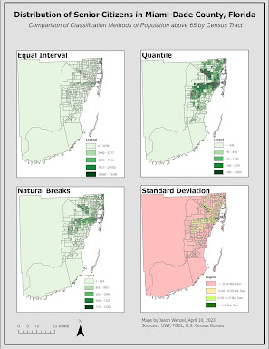
produce maps showing the distribution of senior citizens (individuals above the
age of 65) in Miami-Dade County in tract data from the U.S. Census of
2010. For the main objective, students
were tasked to use and assess four different methods of data classification in
this pursuit: equal interval, quantile,
natural breaks, and standard deviation.
Further, we needed to use two different variables from the census
data: the percentage of individuals
above 65 and the number of individuals (normalized by square mile) above
65. A total of eight maps were produced
with four comprising a composite related to each of the two different age
variables. In addition, I selected one
of the eight that I felt best conveys the distribution of seniors in Miami-Dade
County.I used a green continuous choropleth scheme for all of the maps except for the ones classed on standard deviation. The only adjustment I made was deleting the white default for the lowest values as this color should be avoided because it can clash with the map background. For the standard deviation classification maps, I used a divergent color ramp, but I needed up reducing the brightness of the values, as they were overpowering the map. For example, the coral shades in the current maps are easier on the eyes than the previous default red hue.

I found the maps produced from counts of seniors (normalized by square mile) the best overall at showing the distribution of senior citizens in Miami-Dade County. I found, however, the maps based on percentage over 65 helpful in confirming some of the information in the count/density of seniors.
I believe the best classification method is quantile-count/normalized of population above 65. While the categories contained in it may not be as easy to understand by the lay person as equal interval, the resulting map best shows the areas of Miami-Dade County with the highest concentration of seniors. Unlike the other maps, this one does not distract the viewer with outlying areas (to the west and south/southwest). Instead the outlying areas are colored the lightest (least density above 65) and it does not distract like quantile and natural breaks with a visual “cluttering” effect in the percentage above maps.
If I needed to present one of these to governmental and civic leaders, or the general public, I would use the quantile-count/normalized because it best clearly shows the concentration of
seniors in the county and with less distraction from outlying areas. Overall, I found this lab helpful in enhancing and expanding my skills and knowledge of data classification in cartography and GIS.


Comments
Post a Comment